What’s The Goal of Your Website?
This is the first question I ask my clients. It surprises me how difficult it seems to be to get an answer. It’s pretty hard to build a website if the goal of the site isn’t clear. But one thing I hear all the time is something like this:
“I’d like a rotating slideshow on the homepage.”
As a designer I have to admit that these slide shows are visually appealing. But even though they are enormously popular, I advise my clients against using them. Why? Because unless your website is strictly informational, chances are you’re using it to sell something – a product, a service or an idea. That rotating homepage slideshow that is currently in vogue may actually be making it harder for potential customers and clients to buy what you’re selling.
It’s About Conversion, Not Page Rank
Your analytics reports are telling you that lots of people are visiting your site. Good. When you do a Google search for your business, you’re at the top of the SERP (Search Engine Results Page). Good. You’re not gaining any new customers. Bad! So what’s going on here? If you’re focusing on attaining the number one spot on a Google search then you’re focusing on the wrong thing. Wouldn’t you rather have a hundred new visitors to your site who all end up buying from you than one thousand new visitors who do nothing? Pretty obvious right? The objective is to convert your visitors to customers. It’s time to face the ugly truth. The lovely rotating slideshow that is occupying your homepage’s most coveted real estate is turning potential buyers away.
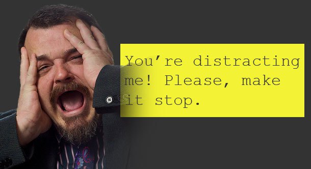
Engage, Don’t Distract
In his regular column on Design, Usability and Conversion, Tim Ash of Marketing Land sites the following:
The whole idea behind image sliders is that a message or image is displayed for a brief while — maybe a few seconds – and then is replaced by another message. But this type of stopping and starting pattern is the most compelling form of movement, because of our evolutionary need to be aware of hidden dangers lurking nearby.
Simply put, the human brain is hard-wired to notice the onset of motion, which makes rotating banners especially distracting. We literally cannot tune them out.
Ash further states:
So, while the movement of the banner may attract the attention of the subconscious, the conscious brain works hard to ignore it.
It May be Time to Break the Habit
Does it really make sense to put your most important information, your key calls-to-action, your value proposition, the “why” of your business in a format that research tells us is likely to be ignored? I like the homepage slideshow just as much as the next guy. I think they look cool and are a good way to attract attention – for a few seconds. That’s how long it’s going to take for your visitors to realize that just before they’ve absorbed the information embedded in the first image, the next one pops onto the screen. The next step is user frustration followed by a quick exit. So unless the sole purpose of your website is to look cool, I would suggest rethinking that rotating homepage slideshow.
But Having Said That …
I should say that even though I advise my clients against using the ubiquitous homepage slideshow, if they insist I will use it anyway. My job is go give them the information they need to make good choices. It’s still their decision.
Now Back to You
Are you hooked on the homepage slideshow? Does your website use one? If so, can you tell how it is effecting your business goals? Does anything I’ve said here make sense?
I’m totally hooked into slideshows, as pretty much every platform and template makes them defacto heros. But, I would like to find out if one video can replace a slideshow and if it makes a difference. I have no idea who does research like this.
Hi Paeon. Thanks for the comment. A lot depends on what theme your’re using. As I said in my post, if a client insists on using a slideshow on the homepage I’ll go along with it but not before letting them know the downside. A lot of times I’ll end up using a slider plugin but only use one image with a text overlay that says something important about the company and has some keywords in it that Google can latch onto. Many slider plugins support video. I’d do a google search for the best slider plugins, I’m sure you’ll find something that works for you.
Thanks. I am starting to use sliders with only one slide and a bit of animation.